
Fig 3.1. Human Information Processing Stages (Preece p. 63)

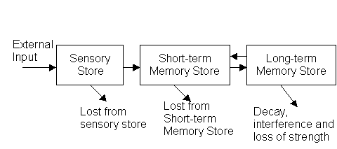
| Sensory Store | Holds information for a very short period of time, sensations, sense
data. Input buffer.
The observations that we pay attention on are transferred into the short term memory. |
| Short term memory - working memory | Can hold a number of units for a limited time ( a few seconds).
The capacity is typically 7+-2 units. |
| Long term memory | Holds information permanently.
The information needs to be associated to other information in order to be available. |
Design should take this into account. User can easily remember for a
short time a few alternatives without visual support. (Telephone numbers
can be remembered for a short time, but if needed to remember for a longer
time some association is needed to support the memory)
How to use in design: Help the user to construct meaningful objects.
Gestalt laws of perceptual organization
A human being is an active observer.
We don't just see things - we need to be able to recognize the object
to see it. Seeing uses objects and processes from our memory.
Graphical Objects can be used to represent phenomena at the interface.
Different graphical objects have different properties. The human being
can make a distinction between different sets of values and alternatives
depending on the method used.
| Coding Method | Max. Num. of Codes | Comments |
| Alphanumeric | Unlimited | Meaning can be self-evident. Location time can be longer than for graphics. |
| Shapes | 10-20 | Effective if code matches object. |
| Color | 4-11 | Attractive and efficient. Similar things easy to match. Warning color effective to attract focus. |
| Line angle | 8-11 | Special cases - wind direction (up, down, back, forward) |
| Line length | 3-4 | Good, relative values, no exact values. |
| Line width | 2-3 | Good, represents power, strength, importance |
| Line style | 5-9 | Good, represents types of connection |
| Object size | 3-5 | Fair, takes up space, Location time longer than for shape and color. |
| Brightness | 2-4 | Can be difficult to make distinction. |
| Blink | 2-4 | Good for getting attention, do not overuse, Limit to small fields |
| Reverse video | No data | Effective to make data stand out. Do no use on large fields. |
| Underlining | No data | Useful, but can reduce legibility |
| Combination | Unlimited | Can reinforce, but can be confusing. |
Software like Excel use different kind of techniques to represent numerical
data
| Scatter plot | Show how two variables are correlated, shows distribution, all values shown. Can use different symbols for different variables. |
| Line graphs or curves | Show how two variables are related. Several curves on one graph. Different line types. |
| Area, band charts | Shaded areas stacked on top of each others. Show combined affects of several things. |
| Bar graphs | Classified presentation of continuous values |
| Pie charts | Relative distribution of data among parts that make a whole (parties, professions, ..) |
Focused attention
Several things are going on simultaneously. We need to help the user
to focus the attention on the important things. Help the user to make the
difference between the necessary and less important information.
Divided attention.
The user can divide the attention between several things at the same
time. (Talking and driving.)
Structure the information
Table is easier than continuous text stream. Structure can give meaning
to information.
Spatial cues
Position important information regularly at the screen (always at the
same position)
Important information should always be visible
Less urgent needs to be easily available (menu)
Not often needed information may need more complex actions to retrieve.
The human being can learn and remember new things if they are meaningful. Things are meaningful if they connect in some ways to the earlier experience. This can be used in designing the interface. Familiar things have associations that help to learn their meaning. Totally new things require longer time and specific attention to learn.
Meaningful names for things
The concepts connected with meaningfulness are familiarity and
imagery.
Familiar words like "door", "read", "stop" - less familiar "compile",
"scan",
Imagery (what it brings to your mind) "rise", "down", "sleep", low
imagery "begin", "increase"
Meaningful interfaces
Use command names that are meaningful and memorable. Highly familiar
words can be confusing. Difficult to make distinction with everyday usage.
Standard menu texts need to be easy to understand (the menu heading
must make clear what you find in that menu)
UNIX commands are in most cases problematic to remember.
Meaningful icons
The meaningfulness depends on context, task, form of representation
and underlying concept.
An icon may not be possible to understand generally, but in a certain
context it can be meaningful.
Icons can be used for
Indicating: System State (busy, printer in action, locked, free)
Warning: Error messages
Identifying: Different icons for different file types.
Manipulation: Tools for zooming, shrinking, printing,
Container: Folder, ordering
Usefull to lable icons with shot lable, the use of pop-up labels is very useful.
Icon types
Resemblance icon Picture of the underlying concept
Examplar icon (property or attribute of the object) (pants for a man
skirt for a lady) (mans shoe vs. ladys shoe)
Symbolic icons When the concept is abstract use a concrete icon for
the concept (glass for "fragile", how about "easy", "heavy")
Arbitrary icons: some standard item (Exclamation mark, Question mark).
Select an icon for
Heavy, Open , Close, New, Old, Duplicate, Draw
Menu-interface vs., UNIX, MSDOS
Knowledge in the head vs. Knowledge in the head
| Property | Knowledge of the world | Knowledge in the head |
| Retrievability | Retrievable when visible or audible | Requires memory search or reminding |
| Learning | Lerning not required. Interpretation substitutes learning. Make interpretation easy. | Requires learning. Learning can be made easier with help of meaningful tools and structuring. |
| Efficency of use | May be slower bacause of the need to interpret (no shortcuts) | Can be efficient for an expert. |
| Ease of use at first time | High | Low |
| Aesthetics | Can be unaesthetic, if too much information is packed on seame screen without structuring | Nothing needs to be visible, more freedom for the designer. |
Key points
Semantic network is a network of objects. Nodes represent objects and connections between them relationships between objects.
Schema is general structure of knowledge, a form with fields for values
of information. The information can be structured according to a schema.
----------------------------------------------------------------------------
Matti Jakobsson, rector, prof. information technology, +358-6-3248202
University of Vaasa, PL 700, 65101 Vaasa, mj@uwasa.fi, www.uwasa.fi/~mj/
----------------------------------------------------------------------------
DELL PentiumIII 500MHz, 64 Mb, 3,2 Gb, 15"
Can you interpret that? why?
HKI - VAASA 19.32 23.00 217,00 132,00
What can this mean? What kind of schema do you need to understand that?
Some things make the metaphor stronger (press a key - see the character on screen) others dont work (backspace, delete, insert)
File cabinet metaphor for file system.
Virtual Interface Metaphor.
The operating system as a Virtual Desktop. Files, Documents, Wastepaper Basket, Printer.
Composite Metaphors
Tools that make it possible to understand a number of different programs
easily
Scrolling
Cut - Copy - Paste
Interface Metaphors
| Application Area | Metaphor | Familiar Knowledge |
| Operating environment | The desktop | Office files, file management |
| Spreadsheets | Ledger sheet | Columnar tables |
| Object-oriented environments | Physical world | Real-world bahaviour |
| Hypertext | Notecards | Flexible organization of structured text |
| Learning environments | Travel | Tours, guides, navigation |
| File storage | Piles | Categirizing objects as urgent, projects,.. |
| Multimedia environments | Rooms | Spatial structure, showrooms, country fair |
| Computer supported cooperative work | Multi-agents | Travel agents, servers |
Users model
Users perception of the system, the metaphor that he uses to learn
the system, documentation, interface. Those aspects of the system that
are visible to the user. The user should be able to build an image on the
real operations of the system using this model.
Design model
The "real" functions of the system, How it works what tasks it performs.
This is how the designers - programmers buld the system.
Norman:" The problem is to design the system so that, first, it follows a consistent, coherent conceptualisation - a design model - and second, so that the user can develop a mental model of the system - a user model - consistent with the design model."